



Introduction
The football field chart is the summary page of a valuation section, and it is usually the only valuation exhibit a board member studies closely. Everything else in the tab exists to support it.
A valuation resting on one method is easy to attack, so bankers present several at once and let the reader see where independent approaches agree. That makes the chart an argument rather than an output. Drawing it is trivial. The judgment sits in deciding which methods earn a place on the page, how wide each range honestly is, and whether the exhibit points toward the same conclusion as the recommendation sitting in front of it.
This post covers where the chart shows up and how the tolerance for imprecision changes from a pitch book to a fairness opinion, which methodologies belong on it, how each bar's high and low ends actually get set, why precedent transactions usually sit above trading comps, when the 52-week range earns a bar, how to choose between a per-share and an enterprise value basis, the conventions for ordering bars and placing the offer price line, and the mistakes that get the page sent back.
What a Football Field Chart Is and Where It Appears
Every valuation methodology produces a range, not a number. Comps give you a multiple range applied to a metric. A DCF gives you a grid of outcomes across discount rates and growth assumptions. Precedent transactions give you a spread of what buyers actually paid. The football field chart is the exhibit that puts all of those ranges on a single axis so a reader can see, in one glance, what the business is worth under every credible approach at once.
The name comes from the layout. Each methodology gets one horizontal bar showing its low and high value, and the bars stack vertically against a shared value axis, which ends up looking like yard markers on a field. Nothing about the chart is mathematically sophisticated. What makes it hard is that every endpoint on every bar has to be defensible on its own, and the whole page has to hang together on one consistent basis of value.
- Football Field Chart
A summary valuation exhibit that displays the implied value range from each methodology (trading comparables, precedent transactions, discounted cash flow, leveraged buyout analysis, and sometimes the 52-week trading range) as horizontal bars on a shared value axis. A vertical line marks the offer price or current share price so the reader can see how the proposed price compares to every analysis at once.
The Job the Chart Does
The chart exists because no single methodology is trusted on its own. A DCF is only as good as a management projection nobody can verify. Comps only tell you what the public market pays for minority stakes today. Precedents tell you what buyers paid in a different market environment. Presenting all of them together is an argument about triangulation: the value is most defensible where independent approaches agree.
That is why the chart is almost always the summary page of a valuation section rather than a working exhibit. It is a conclusion. Every bar on it is backed by three to ten pages of supporting analysis sitting behind the tab, and any number on the page can be picked apart in a board meeting. Analysts get in trouble on this exhibit not for drawing it badly but for putting a bar on it they cannot explain.
The exhibit below shows the standard shape: four analytical bars plus one market reference bar, each spanning its own range, with a dashed vertical line marking the price on the table. A board member reads it in about five seconds, which is exactly why every endpoint on it has to hold up.
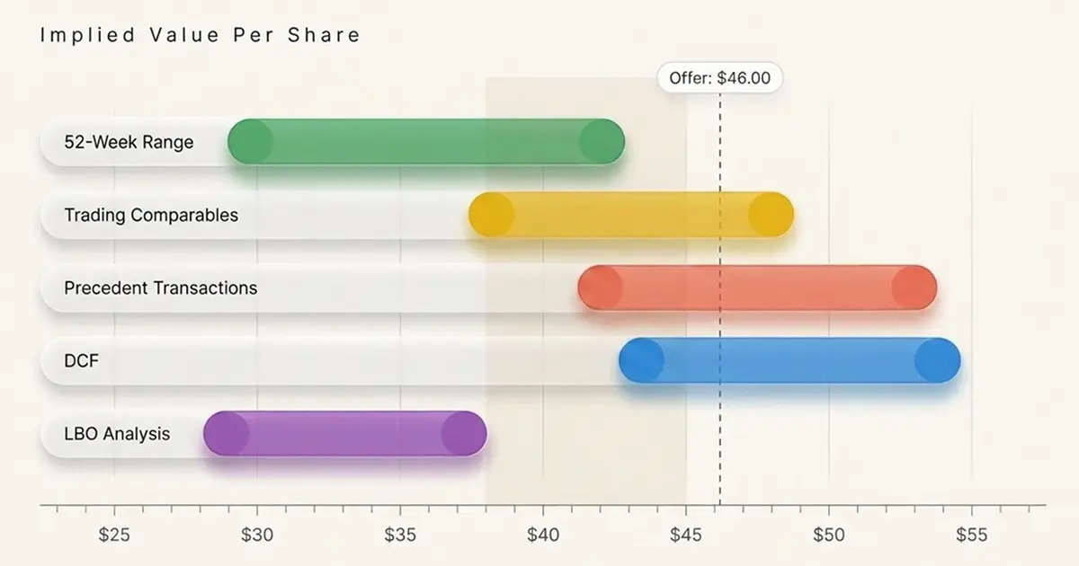
Notice what the geometry already tells you before anyone speaks. The LBO bar sits lowest, so a financial sponsor is not the winning bidder here. The precedent transactions bar sits above trading comparables, which is the control premium showing up. The offer line falls inside the precedent and discounted cash flow ranges but above the middle of the comparables range, which is roughly what a defensible public deal looks like.
Pitch Books, Board Materials, and Fairness Opinions
The football field turns up in three settings, and the tolerance for imprecision drops sharply as you move down the list.
- Pitch books. Used to show a prospective client what the market would likely pay for their business or for a target they are considering. Numbers are based entirely on public information, so bars tend to be wider and footnotes carry more disclaimers.
- Board and committee materials. Presented to a seller's board during a live process, often refreshed weekly as bids come in. These versions use management projections and are the ones that get compared against actual bids on the same page.
- Fairness opinions. The most consequential version. The bank's opinion committee reviews the underlying analyses, and the ranges eventually appear in narrative form in the merger proxy filed with the SEC. If you want to see exactly how banks describe their own ranges, the section describing the financial advisor's opinion, usually titled something like "Opinion of J.P. Morgan" or "Opinion of the Special Committee's Financial Advisor", is the primary source. For background on how that document works, see our explanation of what a fairness opinion is and why boards commission one.
Which Valuation Methods Earn a Bar
Not every analysis in the deck belongs on the summary page. The general test is whether the methodology produces an implied value for the whole business or the whole equity, on a basis consistent with the other bars, using inputs you would defend in front of a board.
The Methods That Almost Always Appear
Four methodologies form the standard core, and most football fields contain three or four of them:
- Trading comparables, showing what the public market pays for similar businesses right now
- Precedent transactions, showing what acquirers have paid for control of similar businesses
- Discounted cash flow, showing intrinsic value based on projected cash flows
- Leveraged buyout analysis, showing the maximum a financial sponsor could pay while hitting its return hurdle, which effectively sets a floor on what a strategic buyer must beat
The LBO bar is genuinely useful in a sale process because it answers a question the board will ask anyway: is there a sponsor bid that clears our expectations? In a deal where sponsors are not credible buyers (heavily regulated businesses, pre-profit companies, businesses with no stable cash flow), the bar gets dropped rather than fudged.
Situational Bars and What Stays Off
Beyond the core four, a handful of methodologies earn a bar when the situation calls for them. A sum-of-the-parts analysis belongs on the chart whenever the company runs distinct businesses that the market values on different metrics, since a single blended multiple would be misleading; our walkthrough of how to build a sum-of-the-parts valuation covers the mechanics. A dividend discount model appears for banks and insurers. Net asset value appears for real estate, natural resources, and holding companies. Analyst price targets and the 52-week trading range appear as market reference bars, usually visually distinguished from the valuation methodologies.
What stays off the chart is anything that does not produce a standalone value for the business. Accretion/dilution analysis tells you whether a deal helps the buyer's earnings, not what the target is worth. A contribution analysis allocates ownership in a merger of equals. Premiums-paid analysis is an input into the precedents bar rather than a bar of its own, unless you are deliberately showing a premiums-paid range applied to the unaffected share price. Putting any of these on the page signals that the analyst does not understand what the exhibit is for.
How Each Bar's High and Low Ends Get Set
This is the part candidates get wrong in interviews. The endpoints are not "the minimum and maximum of my outputs." They come from a deliberately chosen input range, and the value range falls out of that. The distinction matters because it means you can always answer the question "why does this bar stop here?"
| Methodology | What sets the low end | What sets the high end | Typical width (% of midpoint) |
|---|---|---|---|
| Trading comps | Lower-quartile or 25th percentile peer multiple | Upper-quartile or 75th percentile peer multiple | 20% to 30% |
| Precedent transactions | 25th percentile deal multiple | 75th percentile deal multiple | 25% to 45% |
| Discounted cash flow | High discount rate, low terminal growth or exit multiple | Low discount rate, high terminal growth or exit multiple | 20% to 35% |
| LBO analysis | High required IRR, conservative leverage | Lower required IRR, aggressive leverage and exit multiple | 20% to 30% |
| Sum of the parts | Low-end multiple on each segment | High-end multiple on each segment | 25% to 40% |
| 52-week range | Actual trading low | Actual trading high | Whatever it was |
Treat the width column as a rough working range rather than a standard. Nobody publishes typical bar widths, real filings vary widely, and a bar that lands outside these bounds is a prompt to explain the inputs rather than evidence of a mistake.
Trading Comps: The Multiple Range Does the Work
For a comps bar, you pick a multiple range from your peer set and apply it to a single financial metric. The metric is fixed (usually next-twelve-months EBITDA or next-year EPS), so the entire bar width is driven by the multiple spread you select.
Most banks use quartiles rather than the absolute minimum and maximum, because one distressed peer at 4x and one hyped peer at 22x would produce a bar so wide it says nothing. The 25th to 75th percentile range is the common default. Where the peer set is small or the target is genuinely a better or worse business than the median, you narrow to a judgment range around the median and footnote why. Our walkthrough of how to build a comparable company analysis covers the screening and normalization work that has to happen before you can trust any percentile.
Real filings show exactly this structure. In the merger information statement for Olaplex Holdings, J.P. Morgan's selected publicly traded companies analysis indicated a range of implied per share equity values of roughly $1.35 to $1.75, against merger consideration of $2.06 per share, disclosed in the company's definitive information statement on SEC EDGAR. That is a trading comps bar sitting entirely below the offer, which is a common and expected pattern.
Precedent Transactions: Deal Multiples and Premiums Paid
The precedents bar works the same way mechanically, but the multiple range comes from announced transactions rather than current trading levels. You are choosing a range of deal multiples from a screened transaction set, then applying it to the target's metric.
Two wrinkles matter. First, the transaction set is almost always smaller than the comps set, so quartiles are less meaningful and bankers often use judgment endpoints anchored on the two or three most relevant deals. Second, you have a choice of denominator: the target's last-twelve-months metric (which matches how the precedent multiples were calculated at announcement) or a forward metric (which is more relevant but creates an apples-to-oranges comparison). Pick LTM for consistency unless the target's trailing results are distorted, and disclose which you used. Our guide to running a precedent transactions analysis walks through the screening criteria in detail.
A separate premiums-paid approach sometimes drives the precedents bar instead. Rather than applying deal multiples, you take the target's unaffected share price (the price before rumors or announcement moved the stock) and apply a range of premiums observed in comparable deals, say 25% to 45%. This is common when the target's earnings are volatile enough that multiples are unreliable.
Discounted Cash Flow: Sensitivities Set the Endpoints
The DCF bar is the one analysts most often build backwards. The correct approach is to run a sensitivity table across your two most uncertain assumptions, then take the corners of that table as your bar endpoints.
For a perpetuity growth DCF, the two axes are the discount rate and the terminal growth rate. A typical grid might run WACC from 8.5% to 10.5% in 50 basis point steps and terminal growth from 1.5% to 3.0%. The low end of your bar is the high-WACC, low-growth corner. The high end is the low-WACC, high-growth corner. For an exit multiple DCF, the second axis is the terminal EV/EBITDA multiple instead, usually centered on where the comps trade today.
LBO Analysis: Solving for a Return Hurdle
The LBO bar is built in reverse compared to the others. Instead of computing a value from inputs, you fix the output (the sponsor's required return, typically 20% to 25% IRR over a five-year hold) and solve for the maximum entry price that clears it.
The endpoints then come from varying the financing and exit assumptions. The low end assumes conservative leverage and a conservative exit multiple. The high end assumes leverage at the top of what the credit market will support and an exit multiple at or slightly above entry. In practice the LBO bar sits at or below the trading comps bar for most healthy businesses, because a sponsor paying a full control premium on a public multiple usually cannot make the returns work without meaningful operational improvement.
Valuation summary questions separate prepared candidates from memorizers: work through comps, DCF, and precedent transaction questions with full written answers, start practicing interview questions for free and find out which methodology you actually cannot explain under pressure.
Why Trading Comps Sit Below Precedent Transactions
On most football fields, the precedent transactions bar sits visibly above the trading comps bar, and interviewers ask candidates to explain why. The answer is the control premium. Trading comps reflect the price at which small minority stakes change hands on an exchange, where no buyer gains the ability to change anything about the company. Precedent transactions reflect the price paid to acquire the entire business, which comes with the right to replace management, capture synergies, change the capital structure, and sell assets.
- Control Premium
The additional amount an acquirer pays above a target's unaffected trading price to obtain a controlling interest in the business. Control premiums in public M&A commonly fall in the 20% to 40% range, reflecting the buyer's ability to realize synergies, change strategy, and access the target's full cash flows rather than a passive minority position.
The size of the gap is informative on its own. A precedents bar sitting 35% above the comps bar tells the board that recent buyers in this sector have been willing to pay up, which strengthens the seller's negotiating position. A gap of only 10% suggests either that the precedent set is stale, that it includes distressed or minority-stake deals that should have been screened out, or that acquirer appetite in the sector has cooled. Our discussion of how control premiums are set and defended goes deeper on the drivers.
The relationship does invert occasionally. When precedent deals were struck in a materially weaker market than today's (say, transactions from a low-multiple year against a peer group that has since rerated), or when the target's public trading has run up on takeover speculation, the comps bar can sit above the precedents bar. That is not an error to fix; it is a finding to footnote and explain.
The 52-Week Range and Other Market Reference Bars
The 52-week high/low bar is not a valuation methodology. It is a factual record of where the stock traded over the past year, and it appears on football fields for public targets because boards want to see the offer against the range shareholders have actually experienced. A price that clears the 52-week high is easy for a board to defend to shareholders; a price below it is not, regardless of what the DCF says.
Include the 52-week bar when the target is publicly traded, its stock is reasonably liquid, and the trading history is not distorted. Leave it off when the company recently IPO'd (there is no meaningful year of data), when the stock has already run on deal speculation (in which case use the unaffected price and footnote the run-up), or when trading volume is so thin that the high and low reflect a handful of trades rather than market consensus. For a private target, there is no bar at all, which is one reason private company valuation leans harder on precedents and DCF.
Analyst price targets follow similar rules. They are worth showing when a stock has broad sell-side coverage and the targets cluster tightly, since that tells the board what the market currently expects. When only two analysts cover the stock, showing a two-point range dressed up as a bar overstates the information content.
Per-Share Versus Enterprise Value Presentation
Choosing the basis of the chart is the single most consequential formatting decision, and mixing bases on one page is the fastest way to have the exhibit thrown back at you.
When to Use Each Basis
Use a per-share basis whenever there is an offer price, an offer being contemplated, or a public share price to compare against. Boards think in per-share terms because that is what shareholders receive, and fairness opinions are almost universally expressed per share. Any sell-side or public M&A context defaults to per share.
Use an enterprise value basis when the target is private with a messy or changing capital structure, when you are comparing divisional values in a carve-out or sum-of-the-parts, or when the point of the exhibit is operating value rather than what shareholders take home. Enterprise value is also the natural basis in a pitch book about a target the client has not yet approached, where you do not want to imply a specific bid.
Building the Bridge and Getting the Share Count Right
Whichever basis you choose, most methodologies produce enterprise value first, so you need a bridge to per-share. The sequence is enterprise value, less net debt, plus or minus any other claims, divided by fully diluted shares. Merger proxies spell this out precisely. In European Wax Center's proxy materials, for example, Moelis derived its implied per share reference range from an implied total enterprise value range by adding the implied value of the company's tax attributes, subtracting estimated net debt, and dividing by fully diluted shares outstanding as of a stated date, per the filing on SEC EDGAR.
- Fully Diluted Shares Outstanding
Basic shares outstanding plus the shares that would be issued from in-the-money options, warrants, restricted stock units, and convertible securities, typically calculated using the treasury stock method for options and the if-converted method for convertibles. Football field charts on a per-share basis must use the same fully diluted count across every bar, since a different count on one methodology quietly shifts that bar relative to the others.
The share count trap is that dilution depends on price. Options struck at $12.00 are out of the money at a $10.00 valuation and in the money at a $14.00 valuation, so a strictly correct treasury stock calculation gives you a different share count at each end of each bar. Most banks resolve this by fixing the count at the offer price or a single reference price and footnoting the convention. What you cannot do is use one count for the DCF and a different one for the comps. Kennedy-Wilson Holdings' merger proxy, covering its take-private at $10.90 per share, shows the standard approach: Moelis divided its implied equity value range by the company's fully diluted shares outstanding as of a single stated measurement date, February 13, 2026, applied identically across every analysis, disclosed in the definitive merger proxy on SEC EDGAR.
Ordering, Formatting, and the Offer Price Line
The visual conventions are not arbitrary. They exist so that anyone who has seen a football field before can read yours without instruction.
Ordering the Bars
The dominant convention is to order bars by methodology type, moving from market-based to transaction-based to intrinsic, with market reference bars grouped at the top or bottom. A common ordering from top to bottom is: 52-week trading range, analyst price targets, trading comparables, precedent transactions, DCF, LBO.
Two alternative orderings show up. Some groups order strictly by midpoint value, which makes the convergence zone visually obvious but scrambles the analytical grouping. Others put the methodology the bank considers most reliable at the top, which is a subtle way of pointing the reader at the analysis they want emphasized. Pick your firm's house style and stay consistent within a deck. What you should never do is reorder bars between drafts, because the client will notice and read intent into it.
The Offer and Current Price Lines
A vertical line running through all the bars marks the reference price. In a live sale process, that is the offer on the table or the range of bids received. In a pitch, it is the current share price or the unaffected price. Some charts carry two lines, typically the unaffected price and the offer price, which lets the reader see the implied premium and the fairness question at once.
Conventions worth following:
- Label the line with both the price and what it represents, not just a number floating on the axis
- Use a dashed or dotted vertical line so it reads as a reference rather than a data series
- Show the value at each bar endpoint as a label, since readers will otherwise measure against the axis and get it wrong
- Round consistently and in proportion to the share price, often to the nearest $0.05 for a low-priced stock and $0.25 or $0.50 for a higher-priced one, and never show more precision than the analysis supports
- Footnote the metric, the date of the market data, and the projection source under the chart
Every bar on the chart has a full analysis behind it: Download our comprehensive 160-page PDF covering valuation methodologies, M&A analysis, and the technical frameworks interviewers actually test, for the full walkthrough.
Building the Chart Step by Step
The build order matters because the basis decision constrains everything downstream. Deciding halfway through that you want a per-share chart after building three bars on an enterprise value basis means redoing the bridge for each one.
Fix the basis and the date
Decide per-share or enterprise value, pick a single market data date, and lock the share count convention before building anything.
Build each methodology separately
Complete the comps, precedents, DCF, and LBO analyses in full, each on its own tab, with the output range clearly flagged.
Choose defensible endpoints
For each methodology, select the input range (quartiles, sensitivity corners, return hurdle) and record why in the supporting page.
Bridge to a common basis
Convert every methodology to the same basis using one net debt figure and one share count, applied identically.
Sanity check the widths
Compare bar widths against each other. Any bar more than roughly twice the width of the others needs tightening or a footnote explaining why.
Add the reference lines and labels
Place the offer or current price line, label every endpoint, and write footnotes covering source, date, and metric.
Read it as the client would
Ask what conclusion the page pushes the reader toward, and whether that conclusion is the one your analysis actually supports.
Step seven is the one juniors skip. The chart is an argument, and if the argument it makes is not the one in the executive summary, either the chart or the summary is wrong.
Reading the Chart Like a Board Member
Building the chart is only half the skill. Interviewers frequently show a football field and ask what it tells you, which tests whether you understand what the geometry means.
Overlapping Ranges Signal Confidence
When four bars derived from independent inputs overlap across a common band, that band is the strongest statement the analysis can make about value. Independent methods converging is meaningful evidence, because a DCF built on management projections and a comps analysis built on market multiples have almost no shared inputs. That overlap zone is what a banker points to when recommending a price, and it is usually where the negotiating range gets set.
A useful diagnostic: if the overlap zone is narrow and every bar touches it, the valuation is well supported and the debate will be about deal terms rather than price. If the overlap zone is wide because every bar is wide, the chart is technically consistent but analytically empty.
Disjoint Ranges Are a Finding, Not a Failure
When bars do not overlap, something specific is going on and your job is to name it. A DCF sitting entirely above the comps range usually means management's projections are more optimistic than what the market has priced in, which is worth flagging directly rather than quietly adjusting the terminal growth rate until the bars line up. A precedents bar far above everything else typically means the transaction set is stale or included deals struck at cycle peaks. An LBO bar far below the others means sponsors are not competitive buyers here, which changes who you run the process to.
Where the offer line falls relative to the bars is the fairness question in visual form. An offer above the top of every bar is straightforward to opine on. An offer sitting inside the overlap zone is the normal case. An offer below the midpoint of most bars is where the board starts asking harder questions and where the bank's opinion committee spends its time.
Mistakes That Get an Analyst Sent Back
Most football field rejections come down to three recurring problems, and all three are avoidable with discipline before you draw anything.
Bars So Wide They Say Nothing
The most common failure is a chart where every bar spans 40% or more of the value axis, so the overlap zone covers nearly the entire page. This usually happens because the analyst used absolute minimum and maximum outputs rather than a judgment range. A chart that says the company is worth somewhere between $8.00 and $22.00 per share has told the board nothing they did not already know.
Cherry-Picked and Inconsistent Comps
The second failure is a peer set or transaction set assembled to produce a desired answer. Excluding the two lowest-multiple peers because they "are not really comparable" while keeping equally different high-multiple peers is a screening decision that will not survive a diligence question. The defense is a written screening criterion applied consistently: size band, geography, business model, growth profile. Anything excluded should be excluded by the criterion, not by hand.
The related error is inconsistent metrics inside one bar. Using calendarized NTM EBITDA for six peers and fiscal-year EBITDA for three others produces a multiple range that is not comparable to itself, let alone to the target.
Mismatched Basis and Share Counts
The third category is mechanical and the most embarrassing. Building the comps bar on enterprise value, the DCF on equity value, and plotting both on a per-share axis without converting one of them produces a chart that is simply wrong. So does using a diluted share count for the DCF bar and a basic count for the comps, or netting debt as of the last quarter-end for one methodology and as of the latest available date for another.
The fix is procedural. Build one bridge (net debt, other claims, share count) as a single block of cells, and have every methodology reference it. If the bridge changes, every bar moves together, which is the correct behavior.
Key Takeaways
- A football field chart summarizes the value range from each methodology on one axis so the reader can compare them side by side and identify where independent approaches converge
- Every bar's endpoints come from a chosen input range, not from raw minimum and maximum outputs: quartile multiples for comps and precedents, sensitivity corners for a DCF, and return hurdles for an LBO
- Precedent transactions typically sit above trading comps because deal prices include a control premium, and an unusually small gap is worth explaining: a stale transaction set, distressed or minority-stake deals that should have been screened out, or a peer group that has rerated since the precedents were struck
- The 52-week range and analyst price targets are reference bars, not valuation methodologies, and should be visually and verbally distinguished from the analytical bars
- Pick one basis (per share or enterprise value) and one share count for the entire chart, and drive every bar off a single net debt and share count bridge
- Overlapping ranges signal confidence; disjoint ranges are a finding to explain rather than an error to smooth over by adjusting assumptions
- Bars wide enough to be right under any outcome are worthless, and are the most common reason a summary page gets sent back
Conclusion
The football field is the exhibit where all of a valuation section's work becomes a single argument. Every other page in the tab supports it, and it is usually the only valuation page a board member studies closely. That makes it a genuine test of judgment rather than modeling ability: which methodologies deserve to be shown, how wide each range honestly is, and what the chart as a whole is telling the reader.
For interviews, the useful takeaway is that being able to build the underlying analyses is table stakes. What distinguishes a strong candidate is being able to explain, for any bar on any chart, exactly where the high and low came from and why the bar sits where it does relative to the others. Practice looking at a football field and reading it out loud: this bar is here because of the control premium, this one is wide because terminal value dominates, this one is missing because sponsors cannot compete for this asset. That is how bankers talk about the page, and it is what interviewers are listening for.